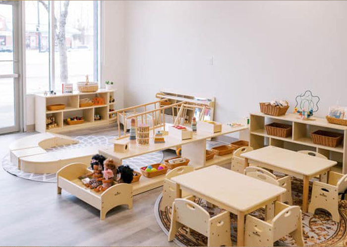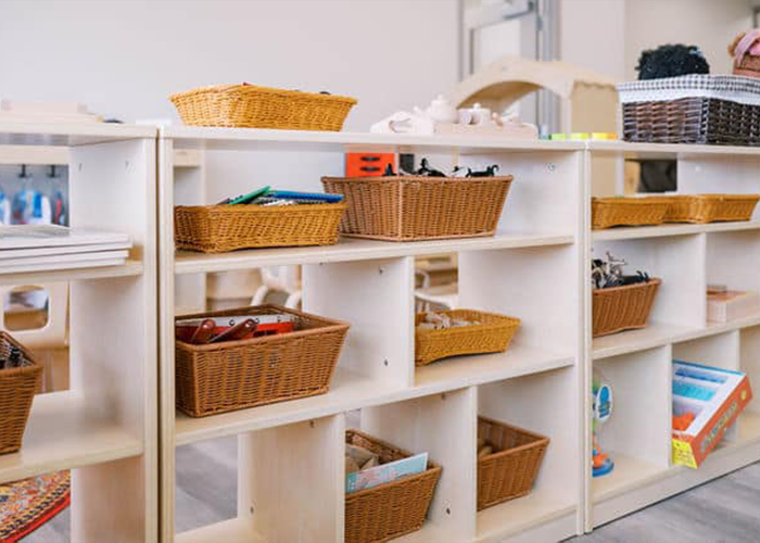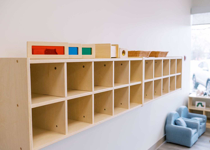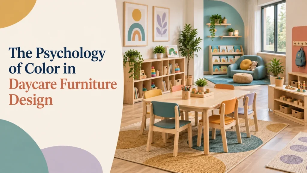
Color in daycare furniture design influences how a room is read, used, and maintained—but it is not a shortcut to a child’s mood or behavior. The strongest approach is to start with program needs, use a calm base palette, and add controlled color to mark activity zones, support wayfinding, and make furniture easy to identify. This guide helps daycare owners, directors, and designers turn color psychology into practical furniture decisions.
Before you choose a finish, ask what the color needs to do. Should it distinguish a quiet reading area from an active play zone? Help children find their cubbies? Make a small room feel lighter? Coordinate with existing flooring and walls? When color answers one of these operational questions, it becomes part of the learning environment rather than decoration added at the end.
Does color really affect children?
Color can influence visual attention and the way people perceive a space, but the effect depends on context. Hue, saturation, brightness, daylight, surrounding materials, activity level, culture, and individual preference all change the experience. A small study of 30 preschool children found that differentiated space—including changes in wall color or ceiling height—was associated with cooperative behavior under the tested conditions. That finding is useful for thinking about zoning, but it does not prove that one color will produce the same behavior in every daycare.
Research on color use in child-care environments also points toward wayfinding and space definition, not a universal list of emotional results. Treat popular claims such as “blue always calms” or “red always increases energy” as design hypotheses to test, not as product specifications. Use the preschool space-and-color study and the review of color use in child-care environments as background, then evaluate your own room with teachers and staff.
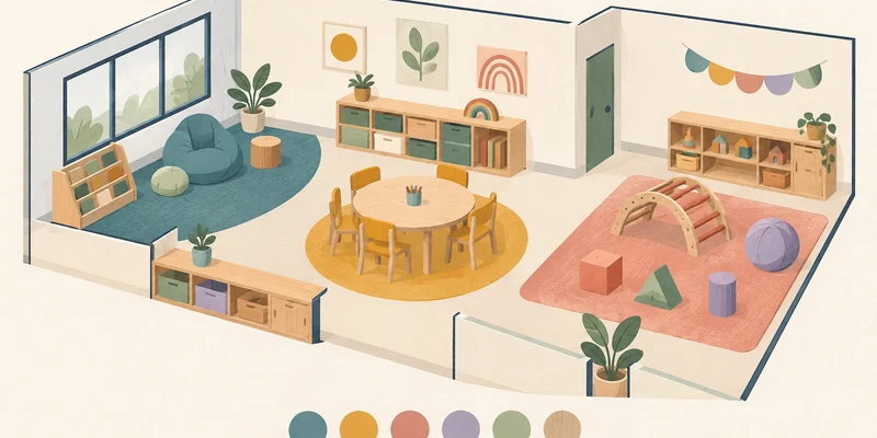
Use color to create clear areas
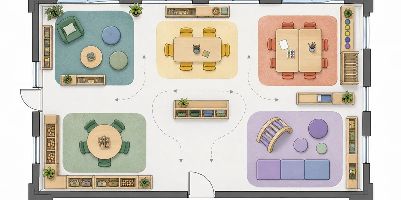
Color works best in daycare furniture when it gives children and adults a consistent visual cue. Instead of assigning a psychological promise to every hue, assign each color family a practical role in the room. Repeat the same cue on more than one appropriate item—for example, a shelf end, chair seat, or storage label—so children can recognize the zone without relying on a single object.
| Activity zone | Color direction | Furniture application | Design check |
|---|---|---|---|
| Reading and quiet work | Low-saturation cool, earthy, or warm-neutral tones | Chair upholstery, shelf backs, low storage, or a small accent panel | Does the palette reduce visual competition with books and materials? |
| Art and messy activities | Medium-tone colors that coordinate with washable surfaces | Table edges, stools, supply storage, or a clearly marked work area | Will the finish still look orderly after frequent cleaning? |
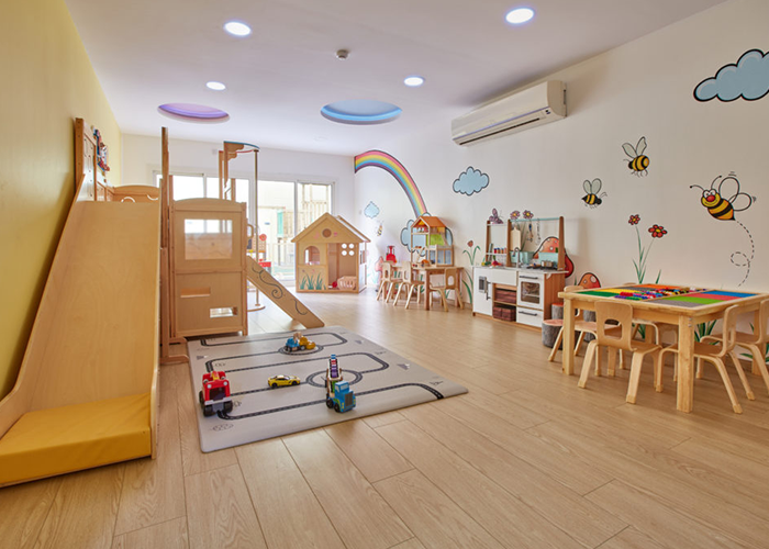
| Movement and dramatic play | Selective, higher-energy accents | Movable chairs, open-shelf ends, role-play furniture, or activity markers | Are active accents limited to the zone rather than spread across the room? |
| Arrival and transitions | One consistent, easy-to-recognize accent family | Cubbies, sign panels, bench details, or storage labels | Are symbols, words, or shapes available so color is not the only cue? |
This approach connects color to the daily routine. A child does not need to know color theory to understand that the teal-marked shelf is for quiet choices or that the mustard-accented storage belongs to the art zone. Review the plan with your classroom layout examples and confirm that each color cue supports clear circulation and adult supervision.
Choosing colors for daycare furniture
There is no universally correct daycare palette. The following guidance is a starting point for comparing color behavior in your actual room, not a promise about how every child will respond.
Yellow and mustard
Yellow and mustard can make furniture feel welcoming and easy to notice. Use them as controlled accents on chairs, shelf ends, or activity markers rather than covering every large surface in a highly saturated yellow. Check the sample in direct daylight and under the room’s artificial lighting; a color that feels gentle in a catalog can look intense beside a bright window.
Blue and teal
Blue and teal are often chosen for quiet or reflective areas because they can read as settled and orderly. They are not automatically calming, however. A dark blue can make a small room feel heavy, while a vivid teal may become the strongest visual target. Use lighter or muted versions when you want the furniture to recede behind books, artwork, or conversation.
Green
Green works naturally with wood, plants, and nature-based learning materials. It can help a furniture palette feel connected across reading, science, and practical-life areas. Test the undertone before ordering: yellow-green, sage, and blue-green create different impressions when placed beside warm wood or cool flooring.
Red, coral, and orange
Warm, vivid accents attract attention quickly, so they are useful for locating a high-interest station or adding energy to a movement area. Use them selectively. If every table, chair, and storage unit competes for attention, the room can feel visually busy and staff may have difficulty creating a quiet transition.
Purple and lavender
Purple and lavender can add imagination and variety without requiring a full themed room. They work well as small accents on cushions, shelf backs, or a defined creative area. Pair them with natural wood or warm neutrals when you want the furniture to remain adaptable as classroom themes change.
Start with a simple base color
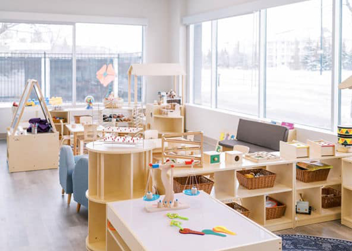
Start with the elements you cannot easily change: flooring, walls, windows, ceiling, built-in storage, and large furniture pieces. A warm neutral or natural-wood base gives children’s materials, artwork, and small color accents room to stand out. A childcare design guide recommends visualizing the room in use and allowing a neutral backdrop to prevent the combined effect of toys, clothing, displays, and equipment from becoming overwhelming.
Do not treat a decorating formula such as “60-30-10” as a childcare standard. Instead, build three practical layers:
- Base: flooring, walls, large storage, and the main wood or painted finish.
- Supporting color: repeated furniture accents that help identify zones without dominating them.
- Changeable color: books, artwork, cushions, trays, and seasonal materials that can evolve with the program.
This layered approach also makes future replacement easier. If a chair or shelf is discontinued, you can match the supporting color family instead of rebuilding the entire room. Before ordering, compare physical samples with your daycare classroom decoration ideas, flooring, window light, and existing displays.
Choose colors for every child
Age and individual needs should change how much visual stimulation you introduce. Infant and toddler rooms often benefit from a calmer background with a limited number of clear visual targets. Preschool rooms can use stronger accents to support choice and independence, provided the room still has places to rest the eyes. The correct balance depends on the children enrolled, the activities planned, and the amount of visual material already present.
Color should support inclusion, not create a new barrier. Never rely on color alone to communicate a rule, route, or storage category. Pair color with words, symbols, shape, location, or tactile information, and keep important edges and furniture features visually distinguishable from their background. For renovation projects, review accessibility and sensory considerations with the appropriate local professionals. The Childcare Center Design for All guide is a useful reference for thinking about visual stimulation and inclusive design.
Help children find their way
A color plan is more useful when it is repeated consistently. If blue-green marks the quiet zone, use it on two or three related elements and keep the cue stable across the school year. Avoid assigning the same accent to two different functions in the same sightline, and do not change the meaning of a color every few weeks without updating the children and staff.
- Repeat a zone cue on furniture, storage, and a simple visual label.
- Keep high-traffic edges easy to see without turning every edge into a bright stripe.
- Use icons, words, and consistent locations alongside color.
- Observe whether children can find and return materials without adult correction.
- Ask teachers whether the palette helps supervision or creates additional visual noise.
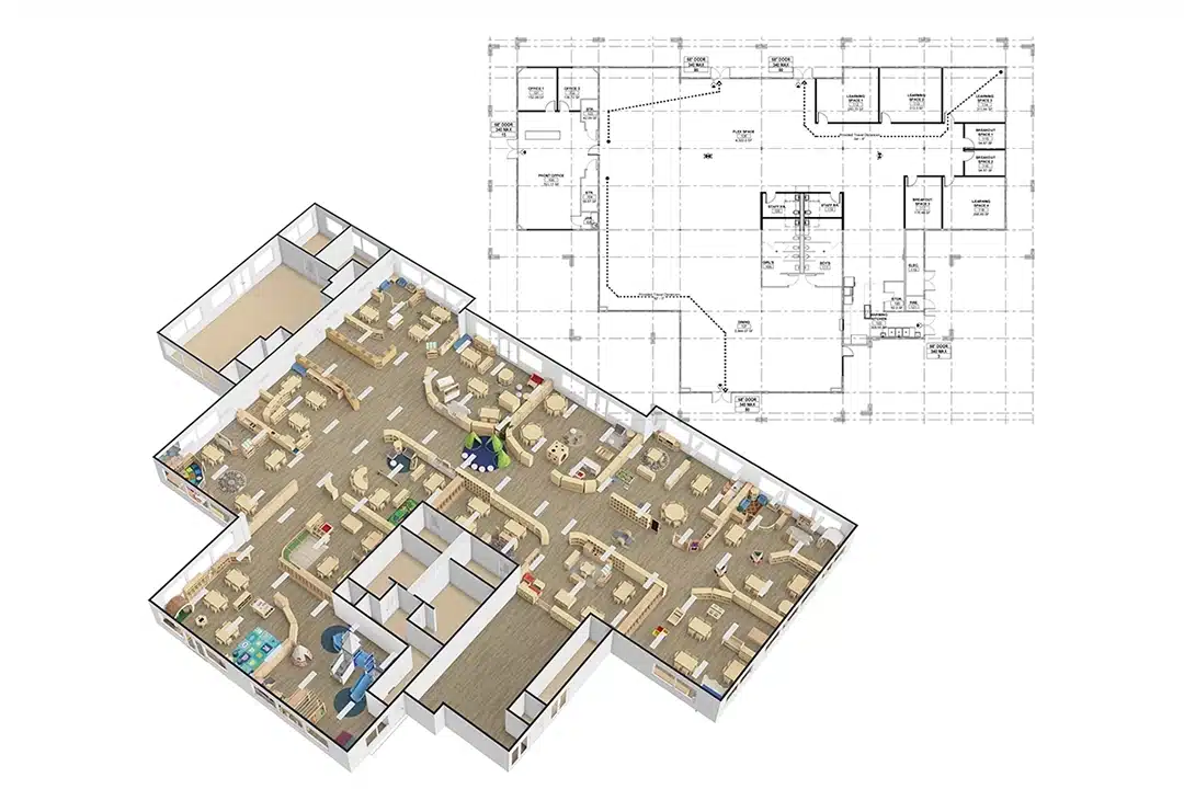
Color should clarify the room’s logic, not replace a good floor plan. If a zone is difficult to understand, first review furniture placement, shelf height, circulation, and sightlines. If the palette is also part of a broader social-emotional plan, compare it with ideas for daycare furniture for social and emotional learning before adding more color.
Pick furniture that is easy to maintain
A beautiful color is not a successful furniture finish if staff cannot clean it, children can quickly damage it, or replacement pieces will not match. Treat color, material, and maintenance as one purchasing decision. When comparing preschool furniture, ask the supplier to document:
- How the surface should be cleaned and which products should be avoided.
- Whether the finish is intended for frequent classroom use and contact.
- How scratches, chips, and high-touch wear can be repaired or touched up.
- Whether the same color can be supplied later for expansion or replacement.
- Which edges, hardware, and exposed surfaces need regular inspection.
- Which sample or finish code should be used for the final purchase order.
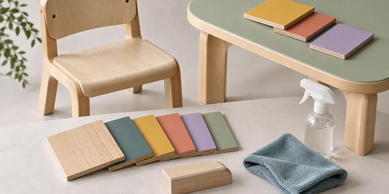
Always view a physical sample beside the actual floor, wall, and lighting conditions. Screens and printed catalogs can shift hue and brightness, and a finish may look different on a large cabinet than on a small swatch. If you are ordering for multiple classrooms, approve one coordinated sample set before placing the full order.
How to plan your color scheme
Use the following process before you approve a palette or request a quotation:
- Map the program: record age groups, activities, group sizes, quiet periods, and the adults who supervise each zone.
- Inventory fixed conditions: note flooring, wall paint, daylight, artificial lighting, existing storage, and finishes that must remain.
- Choose the base: select the main wood, neutral, or painted family that can work across classrooms and future replacements.
- Assign limited accents: choose one or two supporting color families for zoning, wayfinding, or visual emphasis.
- Test full-size samples: place finish samples beside windows, corners, shelves, and the materials children will use every day.
- Review with staff: ask whether the palette improves supervision, cleanup, transitions, and independent material choice.
- Document the decision: keep finish names, codes, sample photos, cleaning notes, and replacement guidance with the purchase records.
Common color mistakes to avoid
- Making every item a visual target: too many saturated chairs, shelves, and wall displays compete for attention.
- Promising a guaranteed behavior change: color is one environmental factor, not a substitute for routines, relationships, or supervision.
- Ignoring light: glare and strong sunlight can change how a finish looks and how comfortable the room feels.
- Using color as the only instruction: children and adults need labels, symbols, shapes, and consistent locations too.
- Choosing by screen image alone: online colors are not reliable substitutes for physical samples.
- Forgetting maintenance: a finish that is difficult to clean or replace will weaken the design over time.
Common questions
Is blue the best color for daycare furniture?
No. Blue can be a useful option for a quiet zone, but the result depends on shade, saturation, lighting, surrounding colors, and the activity taking place. Compare a few muted samples in the actual room instead of selecting a color from a general “calming colors” list.
Should daycare furniture be brightly colored?
Not throughout the entire room. Bright accents can help children notice a defined area or important material, while a calmer base palette leaves space for toys, artwork, and social interaction. Use stronger color where it has a clear job and keep the rest of the environment visually balanced.
Which colors work well in a small daycare classroom?
Start with light, low-saturation neutrals or natural wood, then add one or two carefully repeated accents. This keeps the room open without making it visually empty. Check the palette with the room’s daylight, storage, flooring, and existing displays before you order furniture.
How can color support children with sensory differences?
Use color to reduce unnecessary visual competition and make important zones easier to read, while preserving low-stimulation options. Avoid strong patterns and a large number of competing visual targets, and provide more than one way to understand an instruction. Individual children may respond differently, so staff observation and family or specialist input can improve the plan.
Does furniture color affect children’s learning?
Color may influence how children notice and interpret an environment, but it does not work independently from teaching, furniture arrangement, light, sound, materials, and relationships. Use color to support clear zones and comfortable use; do not claim that a finish alone improves learning outcomes.
Conclusion
The psychology of color in daycare furniture design is most useful when it leads to better decisions about zoning, attention, wayfinding, inclusion, and maintenance. Choose a calm base, add purposeful accents, test samples in real light, and review the result with the people who use and clean the classroom. A thoughtful palette should make the room easier to understand and adapt—not promise a fixed emotional response from every child.
Planning a new daycare or refreshing several classrooms? Share your floor plan, age groups, activity zones, and furniture needs with Xiha Montessori’s classroom design and layout team to develop a coordinated, practical furniture palette.