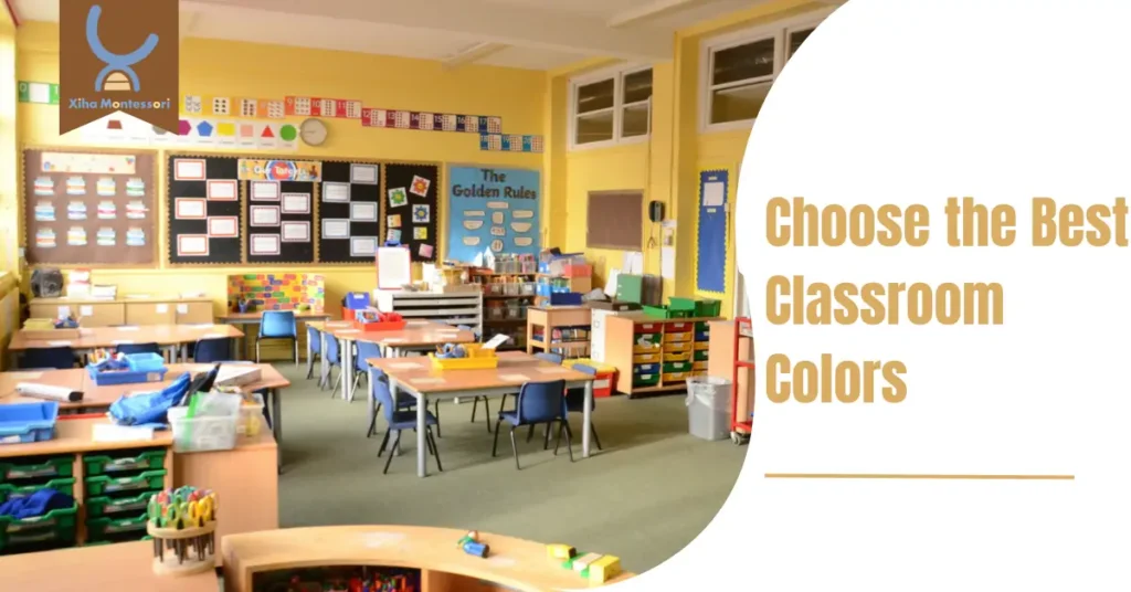
Are you looking to create an optimal learning environment for your students? An often overlooked factor that can greatly impact your child’s educational experience, an essential factor to consider is classroom colors. Classroom colors can have a significant impact on learning and classroom management.
Research has shown that certain colors can evoke specific emotions and influence our mood and behavior. A well-chosen color scheme can promote student focus, creativity, and productivity. On the other hand, the wrong colors can lead to distraction, restlessness and shorter attention spans.
It is important to balance stimulation and a calming environment when choosing classroom colors. Different age groups and subjects may have different color preferences, so it’s important to consider the specific needs of your students.
Whether you’re a teacher, parent, or school administrator, understanding the psychology behind different colors can help create an environment that promotes focus, creativity, and positive energy. This article will examine choosing the best classroom colors to improve student engagement and academic performance.
What Impact Do Classroom Colors Have on the Environment?
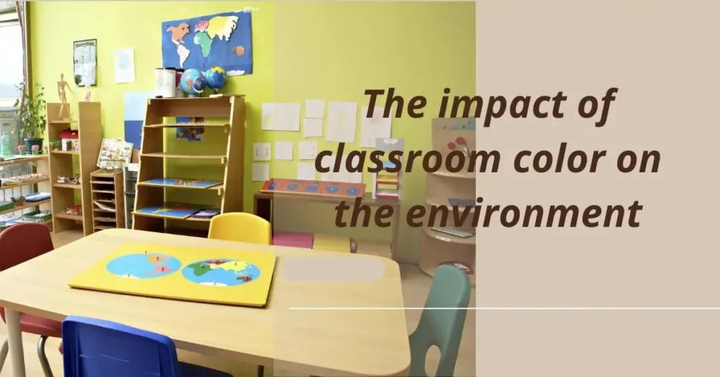
Colors profoundly affect our emotions and behaviors, making their classroom application a powerful tool for influencing student mood and engagement. Warm colors like red and orange can invigorate and stimulate, and they are suitable for physical education spaces or creative areas. In contrast, cool tones such as blue and green promote calmness and focus, which is ideal for traditional classrooms where concentration is key.
The selection of colors can also foster inclusivity. Certain colors can minimize glare and visual strain for students with specific learning and attention difficulties, creating a more accessible classroom environment.
Using Color Psychology in Classroom Design
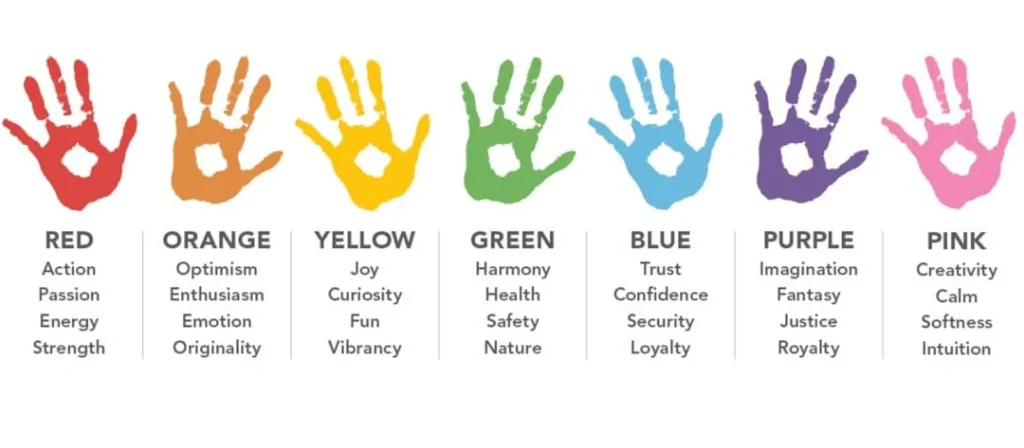
Color psychology is the study of how colors influence human emotions and behavior. In the context of a classroom, the colors you choose can affect how students feel, concentrate, and engage with learning materials. Different colors evoke different responses—some colors help calm, while others stimulate creativity or focus. When designing your classroom, it’s essential to consider how these colors interact with each other and how they can be used strategically to promote a positive learning environment.
Evaluate the Classroom Environment
Before deciding on the colors, take a moment to assess the current state of your classroom. Does it feel too chaotic? Is it too dull, lacking energy? Or does the color scheme leave students distracted? It’s essential to consider the classroom’s size, the amount of natural light, and the kind of activities you typically hold there.
Balance Colors
One of the most crucial elements of color psychology in classroom design is balance. Too much of a particular color can either overwhelm or disengage students.
A good rule of thumb is the 60-30-10 rule: 60% of the room should be neutral, 30% should be a dominant color, and 10% should be accent colors. This balance keeps the classroom visually appealing without overwhelming the senses.
Use Accent Colors
Accent colors are small but impactful details that can make a classroom feel more dynamic and engaging. These can be used in furniture, rugs, or bulletin boards. Accent colors like yellow, orange, or red can energize a classroom, making it feel vibrant and inspiring.
Consider Student Preferences
While color psychology gives us general guidelines, each student is unique. Some children might feel more comfortable in a calming green space, while others may thrive in a more energetic yellow room. It’s essential to take into account the preferences and needs of your students. Try involving them in the process by asking for their opinions on color choices or creating spaces that cater to various needs.
Experiment with Color Combinations
Don’t be afraid to experiment with different color combinations to see what works best for your classroom. Try out different shades of blue, green, yellow, or even unconventional colors like purple or orange. Test them in smaller areas of the classroom before making a full commitment.
Once you settle on a color palette, observe how students react. Are they more engaged in certain activities? Do they appear calmer during lessons? Adjust the colors as needed until you find the right balance for your classroom.
The Best Color to Use in a Classroom Environment
Choosing the right colors for different classroom areas is essential for enhancing students’ learning, creativity, and well-being.
Learning Area
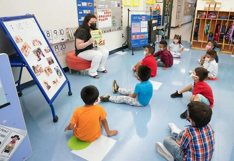
Learning areas require classroom colors that enhance concentration and minimize distractions. Light blue is an excellent choice, promoting calm and focus. Green also reduces eyestrain, making it ideal for extended periods of study.
Activity Area
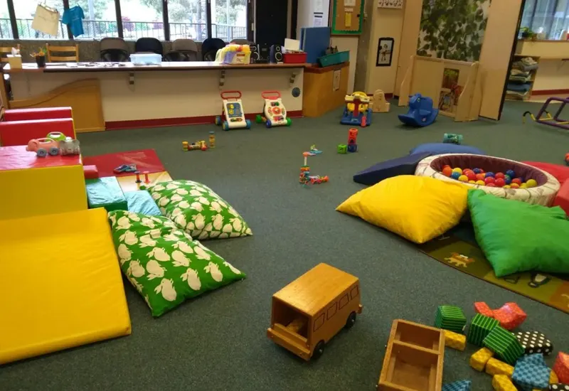
Activity areas benefit from bright colors that inspire energy and creativity. Bright yellows and oranges can be energizing and inspiring, making them perfect for spaces dedicated to arts, crafts and physical education.

Office
The office area is where administrative tasks occur and requires a balance of calm and energy. The color blue fosters trust and efficiency, while the color green maintains a relaxed atmosphere. These classroom colors can foster positive interactions between staff and students.
Reading Area
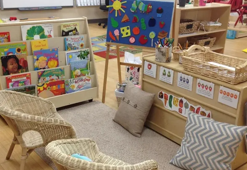
A reading area should feel comfortable and inviting, encouraging students to immerse themselves in literature. Warm earth tones, such as beige or soft browns, paired with log-colored bookshelves can create a cozy atmosphere.

Eating Area
The eating area should be warm and inviting, promoting social interaction and relaxation. Soft yellow stimulates appetite and communication, while red accents create a vibrant dining experience. These colors should be used carefully to avoid creating an overly busy atmosphere where relaxation is the goal.
By considering the psychological impact of color, the effective use of color in different classroom areas can significantly improve the learning environment and make it more responsive to student needs and activities.
The Impact of Classroom Colors on Learning
The correlation between color and learning is undeniable. The right classroom colors can improve attention, memory, and student engagement. For example, blue has been linked to improved attention and cognitive performance, making it a top choice for academic environments.
Innovative teaching methods can also be supported through color; vibrant hues can stimulate creativity and encourage dynamic interaction within the classroom. Conversely, overstimulation through excessively bright or clashing colors might distract or unsettle students.
What Colors Helps With Learning?
Everything can be affected by color, and different classroom colors can create different moods, here are some of the ways that color can affect moods and more
1. Orange

With its warm and vibrant tone, Orange encourages social interaction, making it an excellent choice for group activity areas. It stimulates creativity and enthusiasm, helping students feel more engaged and open to communication.
2. Red

Red is the color of stimulation, capable of raising energy levels and attention. It’s best used in areas where physical activity or alertness is required. However, its intensity means it should be used sparingly to avoid causing feelings of anxiety or agitation.
3. Green

Green is known for its calming effects, reducing stress and helping students focus. It’s an ideal color for core learning areas, providing a restful and soothing backdrop that can enhance concentration and efficiency in learning.
4. Yellow

Yellow, the color of optimism, stimulates mental activity and generates a positive learning atmosphere. It encourages creativity and makes students feel energized and happy. Yellow is best used in creative spaces or to highlight key learning materials.
5. White

White creates a sense of space and clarity, offering a clean background that enhances other colors. It promotes an organized environment but should be balanced with other colors to avoid feeling too sterile or bland.
The Impact of Classroom Colors on Mood and Behavior
Warm Colors
Warm colors like red, yellow, and orange can energize students. Red increases alertness and stimulates creativity. Yellow enhances creativity and grabs attention. Orange lifts mood and promotes enthusiasm. These colors can invigorate a classroom, making it suitable for creative subjects and activities.
Cool Colors
Cool colors such as blue and green create a calming effect. Blue promotes memory retention and enhances creativity. Green brings balance and harmony, symbolizing relaxation and stability. These colors are ideal for subjects that require focus and concentration, like math and science.
Neutral Colors
Neutral colors like beige, gray, and white provide a balanced backdrop. These colors do not distract students and allow other colors to stand out. Neutral tones can help create a versatile learning environment. They work well in classrooms where various activities take place.
Practical Tips for Choosing Classroom Colors
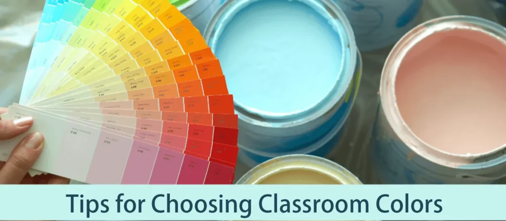
1. Consider the Purpose of the Room
Learning Areas
Classroom colors should align with the purpose of the learning area. Yellow can improve concentration and enhance memory. This color works well in areas dedicated to subjects like history and languages. Red can boost creativity and alertness, making it suitable for art and creative writing spaces. Green promotes relaxation and stability, which helps students focus on tasks requiring deep concentration, such as reading and science.
Play Areas
Play areas benefit from vibrant and energetic colors. Orange boosts mood and inspires engagement. This color keeps students alert and fosters self-confidence. Yellow can also stimulate creativity and create a lively atmosphere. Bright greens and blues add a playful yet calming touch, ensuring a balanced environment where children feel energized and relaxed.
Relaxation Areas
Relaxation areas require calming and soothing colors. Soft blues create a sense of calm and well-being. These colors help students unwind and reduce stress. Light greens promote clarity and reduce anxiety, making them ideal for quiet corners or reading nooks. Neutral tones like beige and light gray provide a serene backdrop, allowing students to relax without distractions.
2. Balancing Bright and Subtle Tones
Avoiding Overstimulation
Overstimulation can hinder learning. Classroom colors should strike a balance between bright and subtle tones. Loud colors like red, orange, and yellow can boost performance but should be used sparingly. Too much brightness can overwhelm students. Incorporating neutral tones like white or gray can help balance the vibrancy, creating a harmonious environment.
Creating a Calming Environment
A calming environment enhances focus and reduces stress. Cool colors like blue and green are ideal for this purpose. Blue promotes memory retention and enhances creativity. Green brings harmony and balance, making it easier for students to concentrate. Combining these colors with neutral tones can create a soothing atmosphere conducive to learning.
3. What are the Most Calming Classroom Colors?
Symbolizing the sky and the sea, blue exudes tranquility and stability, qualities that can transform a classroom into a peaceful haven conducive to learning. Lighter shades of blue can help regulate heart rate and reduce anxiety, making them ideal for supporting students’ emotional and mental well-being.
Incorporating blue into classroom design not only aids in maintaining a calm atmosphere but also supports sustained attention and focus, which are crucial for effective learning and teaching.

What Are the Best Classroom Colors to Work With?
Choosing classroom colors involves balancing psychological impact with functional design. Best classroom colors that effectively enhance learning environments are:
1. Blue – The Calming Color
Blue is widely regarded as one of the most effective classroom colors for creating a calm and focused atmosphere. This color has been shown to reduce anxiety and promote concentration, making it an excellent choice for areas where students need to focus and engage in detailed tasks, such as reading or problem-solving. It’s also a color that’s generally liked by children and creates a peaceful environment, allowing them to feel comfortable and at ease.
- Encourages concentration
- Reduces stress and anxiety
- Creates a calming atmosphere
- Great for focus-based learning activities
Best Places to Use Blue:
- Reading corners
- Study areas
- Quiet zones
2. Green – The Color of Growth and Balance
Green is another top choice for classrooms, as it is associated with nature, growth, and harmony. This color has been shown to promote mental clarity and balance, making it ideal for classrooms that aim to stimulate both creativity and focus. Green also has a calming effect, helping to reduce feelings of frustration or agitation that may arise during challenging lessons.
- Represents balance and growth
- Stimulates creativity and focus
- Promotes harmony and relaxation
- Reduces eye strain during long study sessions
Best Places to Use Green:
- Creative or arts-based areas
- Group workspaces
- Classrooms with high activity levels
3. Yellow – The Cheerful and Energizing Color
Yellow is often associated with happiness, energy, and optimism. It’s a color that encourages creativity and enthusiasm, making it a great choice for classrooms where active, hands-on learning takes place. However, it’s essential to use yellow in moderation, as too much of this bright hue can cause feelings of anxiety or agitation in some children.
- Stimulates creativity and enthusiasm
- Promotes energy and positivity
- Great for dynamic learning activities
- Can inspire a sense of warmth and friendship
Best Places to Use Yellow:
- Art stations
- Interactive learning zones
- Creative corners
4. Red – The Color of Excitement and Passion
Red is often used to draw attention and create a sense of urgency. It’s a powerful color that can energize children, but it should be used sparingly in classrooms. Too much red can cause overstimulation, leading to restlessness or irritability in students. When used in moderation, red can be great for sparking enthusiasm, excitement, and motivation, particularly in areas where students need a little extra boost.
- Boosts energy and enthusiasm
- Encourages excitement and passion
- Effective for motivating children
Best Places to Use Red:
- Activity corners
- Motivational posters and visuals
- Interactive or science areas
5. Orange – The Color of Creativity and Enthusiasm
Orange is a warm and inviting color that balances the excitement of red and the calm of yellow. It promotes creativity and social interaction, making it a fantastic choice for collaborative learning spaces. Orange is also known to stimulate communication, so it’s perfect for areas where group discussions or team projects are taking place.
- Encourages creativity and social interaction
- Invites collaboration and communication
- Energizes the classroom without overwhelming
Best Places to Use Orange:
- Group learning areas
- Social hubs or discussion spaces
- Play areas or hands-on learning zones

Choose Colors According to Age Group
Children’s responses to color evolve with age. For younger children, bright and vibrant colors can create a stimulating and welcoming environment, encouraging exploration and learning. As children grow, incorporating calming colors like blue and green can help maintain focus, especially for students transitioning to more structured learning activities. Adolescents may appreciate a more sophisticated color scheme that mirrors their maturing tastes, integrating neutral backgrounds with strategic color accents to support concentration and inspire creativity.
1. Preschool and Kindergarten
Young children respond well to bright, warm colors. Red, yellow, and orange can stimulate their senses and engage them. These colors can make the classroom feel lively and welcoming. Bright greens and blues can also create a playful yet calming atmosphere.
2. Elementary School
Elementary-aged children prefer tints and pastels. Soft shades of blue and green promote calmness and focus. Light yellows can enhance creativity without causing overstimulation. These colors can help maintain a balanced environment conducive to learning and exploration.
3. Middle School
Middle school students enjoy a mix of vibrant and subdued colors. Bright colors like red and orange can stimulate energy and creativity. Cool colors like blue and green can provide a calming effect. Combining these colors can cater to the diverse needs of middle school students.
Choose the Right Colors Palette for Your Classroom
Choosing the right color palette requires understanding classroom color meanings and goals. This helps to maintain focus and reduce stress.
Classroom colors and meanings
| Color | Color Meaning |
|---|---|
| Blue | Order, direction, peace, spiritual |
| Green | Balance, harmony, nature |
| Brown | Earthy, structure, support, honesty |
| Yellow | Sunshine, renewal, hope |
| White/Beige | Pure, light, innocence, completion |
How to Mix and Match Classroom Colors
When selecting the best classroom colors for kids, it’s important to strike a balance between calming and energizing hues. A combination of cool and warm colors can create a harmonious environment where children feel both focused and inspired. Here are a few tips for mixing and matching:
- Use Accent Walls: Choose a neutral color for the majority of the room and use accent walls in stimulating colors like red, yellow, or orange to add vibrancy.
- Consider the Lighting: The color of the walls will look different under artificial lighting versus natural light. Always test colors before committing to a full wall.
- Incorporate Natural Elements: Bring in natural materials like wood or plants to balance out bold colors and add warmth to the space.
- Match Colors to Learning Activities: For example, use calming blues and greens for study areas and energizing yellows or oranges for collaborative spaces.
Classroom Colors Trends and Popular Choices
Staying abreast of classroom colors trends can provide fresh ideas and inspiration, ensuring that learning environments remain modern and engaging.
Current Trends in Educational Design
Current trends in educational design favor flexibility, sustainability, and inclusivity. A shift toward colors that create a calm, focused atmosphere is recommended. In terms of classroom colors, this translates into natural, soothing palettes that reflect the outside world and adaptable spaces that can be customized with different color palettes to accommodate a variety of learning activities.
Popular Color Choices
Popular color choices in contemporary classrooms include soft blues, yellows, and greens for a calming effect and neutral tones that can serve as a backdrop for more energetic accents. These choices reflect the trend of creating serene, focused environments conducive to learning and personal growth.
Innovations in Classroom Colors Use
Innovations in color use include interactive walls painted with writable, washable paint that allow students to engage directly with their environment. Another trend is using thematic color schemes that support classroom themes, making the classroom a learning tool.
The strategic use of classroom colors is a dynamic and evolving field that reflects the latest educational research and design trends. By carefully considering the psychological impact, age appropriateness, and current trends in the use of color, educators can create spaces that look appealing and actively support student learning and emotional well-being.
Expert Recommendations
Insights from Educators
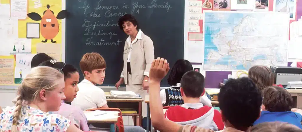
Educators emphasize the importance of choosing the right classroom colors to support learning. Teachers at Bright Elementary School observed that yellow enhanced student creativity and engagement. Blue in reading areas helped students concentrate better. Green in science and math areas promoted a sense of calm and stability.
- Yellow: Enhances creativity and engagement.
- Blue: Promotes concentration.
- Green: Creates a calming environment.
Insights from Color Psychologists
Color psychologists highlight the impact of colors on mood and behavior. According to studies, warm colors like red and yellow can energize students and stimulate creativity. Cool colors like blue and green are calming, promoting focus and relaxation. Neutral colors provide a balanced backdrop, allowing other colors to stand out without causing overstimulation.
- Warm Colors: Energize and stimulate creativity.
- Cool Colors: Promote focus and relaxation.
- Neutral Colors: Provide a balanced backdrop.
Conclusion
The right classroom colors can enhance mood, improve concentration, and even promote better communication. Educators should consider each room’s purpose and their students’ age group. By incorporating these principles into classroom design, educators can significantly impact the educational experience of their students, making every lesson a learning opportunity and a sensory experience that supports their overall development.
Educators should observe the effects of the chosen colors. Adjustments can be made based on student responses.

